Noise Review
In this section, noise, in the statistical sense will be reviewed in the hopes to offer greater foundation to how different types of noise are used in special effects. A review of sinusoidal signals is provided first to lay some groundwork between the time and spatial domains and the frequency domain. The concept of noise is then discussed with a specific focus on two common distributions. The below plots were produced using Matlab.
Basic Signals
One Dimension
To better understand noise, it is helpful to first take a look at something not considered noise. A 5-Hz sinusoidal signal is shown below over a one second window. The signal is completely defined at each moment in time according to its function. The viewer can easily count how many cycles there are within the one second window. 
Separate from the time domain, the frequency domain provides another meaningful view of this signal. The frequency domain is useful in quickly identifying frequencies of interest and can be helpful in showing the power distribution of a signal across the frequency band or spectrum. In this case, the fast fourier transform (FFT) was used to transfer the signal to the frequency domain and the magnitude was selected. The FFT operation produces a complex result when operating on real values (as is the case here) providing information regarding the magnitude and phase (or angle) of the signal in the frequency domain. The phase is linear for this case, and is not shown here. The magnitude for this 5-Hz signal, however, is shown below. The viewer can quickly see the peaks at +/- 5-Hz below (the negative frequencies being a result of the mathematics).
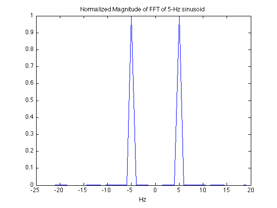
It should be mentioned the this signal was actually sampled at a much higher rate than what is shown as the maximum frequency here (i.e. it is not the Nyquist rate). The plot was zoomed in to focus on the frequency axes, and highlight the 5-Hz frequency location.
Two Dimensions
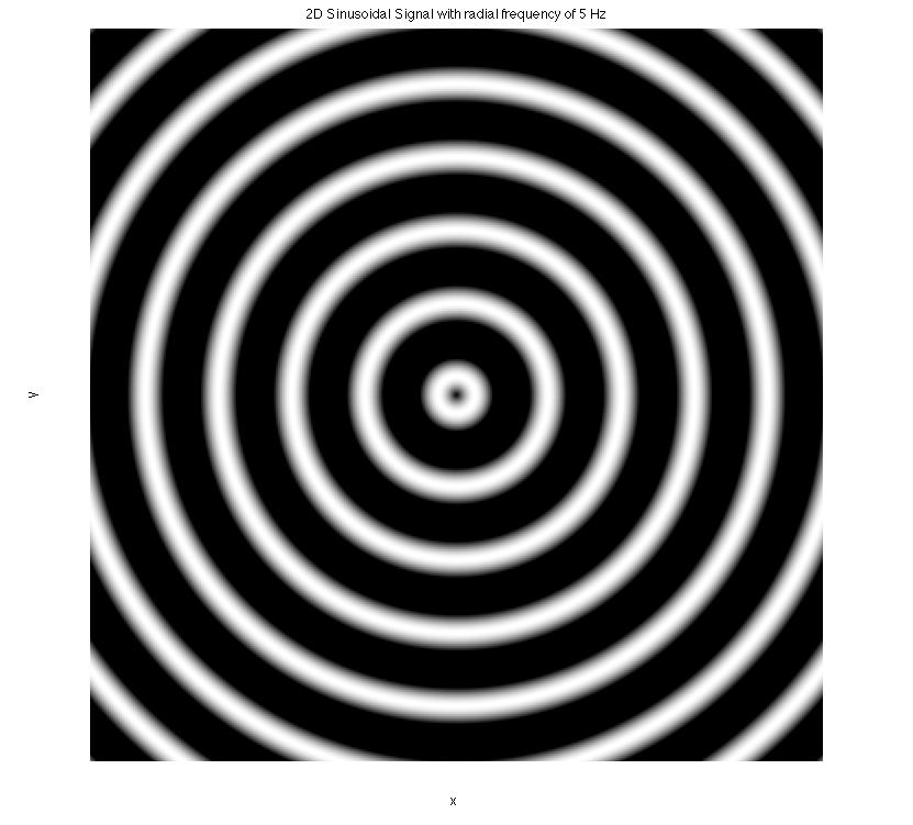
Signals are not just limited to one dimension, but can be extended to any number of dimensions. Visually signals in a meaningful way becomes more difficult with each added dimension. Extending the 5-Hz sinusoidal signal to a 2D radial dimension produces the following result.
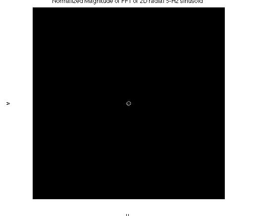
Transforming to the frequency domain and examining the magnitude results in the following plot which shows a 5-Hz ring about the center.
Noise Signals
Noise signals, in this statistical case, are synonymous with random signals. Random signals, by definition, are not as explicitly defined for every instant of time like the 5-Hz sinusoid was above. Instead, random signals are defined by their distributive properties, such as the mean or variance. Some random signals, such as Gaussian signals, can be completely characterized by their mean and variance. The mean and variance are also referred to as the first and second moments. Other random signals needed higher moments to be fully characterized.
Paintball Example
To better understand what is meant by a signals's distributive properties, consider someone who is testing out their new paintball gun by shooting paintballs at a bulls-eye like target. The mean refers to where the paintballs are likely to strike on average. If the paintballs hit the center of the target most often, then it would be said have a zero-mean. The variance gives a reference to how far from this mean the paintballs are scattered on average.
Common Distributions used for Noise
There are a number of models used to measure and create random distributions. The randomness, or apparently lack of structure, gives rise to the idea of noise. Two of the most common random distributions used for noise are the uniform and Gaussian random distributions.
Uniform
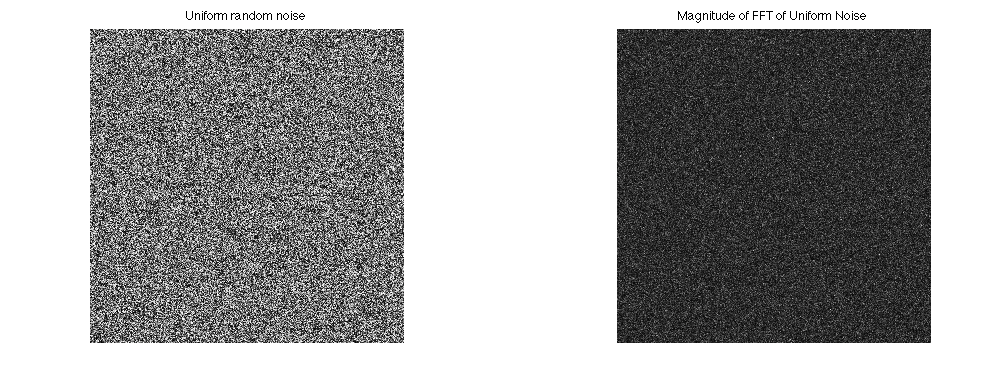
A uniform distribution gets its name because the results of its experiment are evenly or 'uniformly' distributed across the sample space. In the figure below, the plots on the left side show a uniform random signal whose sample space is between 0 and 1. This sample space gives a mean value of 0.5 which is the average value over this sample space. This mean is referred to as a DC (direct current) bias in the frequency domain and shows up as the large spike at the 0-Hz. AC (alternating current) signals have a frequency and thus will show up outside of 0-Hz. Regardless, this large spike dominates the frequency spectrum and makes it unclear if the energy in the signal is in fact evenly distributed across its domain. Removing the 0.5 mean value from the signal and looking at its frequency spectrum produces the plots on the right hand side.
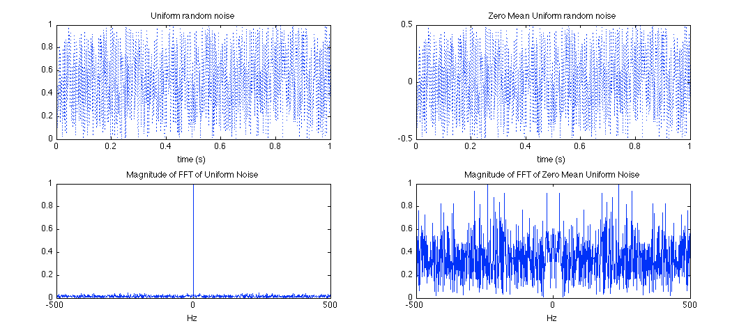
It can be seen now that signal is distributed around 0 by observing the y-axis on the upper right plot and that the original DC spike has been removed from the frequency domain revealing a more even distribution of frequency.
Gaussian
A Gaussian distribution, often referred to as a normal distribution, gives a bell shaped curve with the top of the curve representing where the majority or average number of experimental results will lie. The width of the bell-curve provides a visual cue to how spread out the distribution will be from that center point.
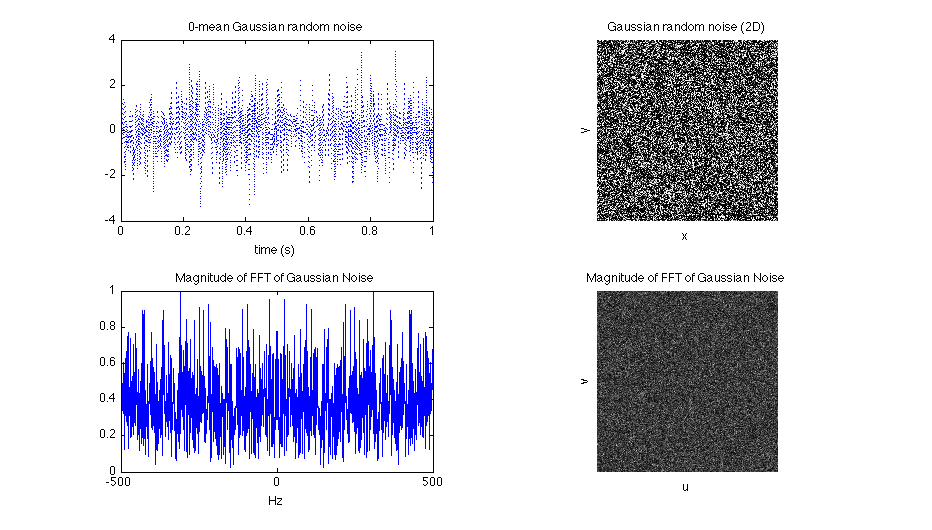
Visually, there are differences between the 2D-plots of the uniform and gaussian noises. In particular the range of values in the Gaussian plot is not bound to a particular range here like it was for the uniform case. The range of a uniform distribution can be extended to cover a larger area, and a Gaussian distribution can be adjusted to have the majority of its samples fall closer to the mean. Still, no matter how narrow the bull-curve is shaped in a Gaussian distribution, there remains some minute probability that any value up to infinity can be produced.
The power spectrum of both the uniform and Gaussian distributions also looks just like noise. This is a useful observation, particularly in spectral synthesis methods, where a noise can be produced and taken to be the frequency domain of some noise in the spatial domain. This is useful since it effectively eliminates the computational cost of having to transform the noise into a frequency domain using an FFT algorithm.
The uniform and Gaussian signals still look just like noise and another method of showing their distribution distinctions is necessary. A histogram is useful for counting the number of times a value of some function or plot falls within a particular range. Plotting histograms as bar charts gives a more accurate view of a signals distribution. The results for the uniform and Gaussian distributions are shown below.
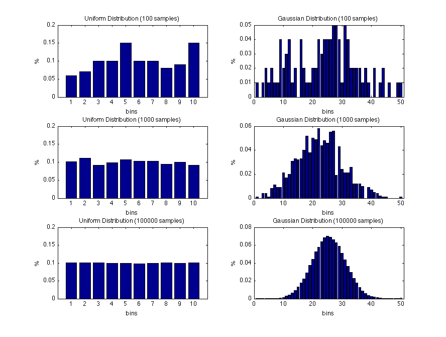
It can be seen that as the number of samples or experiments run is increased, the behavior of the plots approaches the theoretical expectation of the distribution. The uniform distribution on the left reaches a 10% of a number landing in a bin if there are 10 equally spaced groupings or bins to fall into. The uniformity of this distribution is most clearly seen in the lower left plot. Similarly, the bell-curve of the Gaussian distribution is most clearly seen in the lower right plot.
Conclusion
There are many different types of distributions that can be used as noise. Typically, noise is more often than not an undesirable quantity, however in special effects this is not the case. Understanding how to shape and control noise can be very useful in creating interesting and visually pleasing results. Uniform and gaussian distributions, while helpful in understanding properties of noise, are actually too random to produce the desirable interesting and repeatable results needed for most effects.
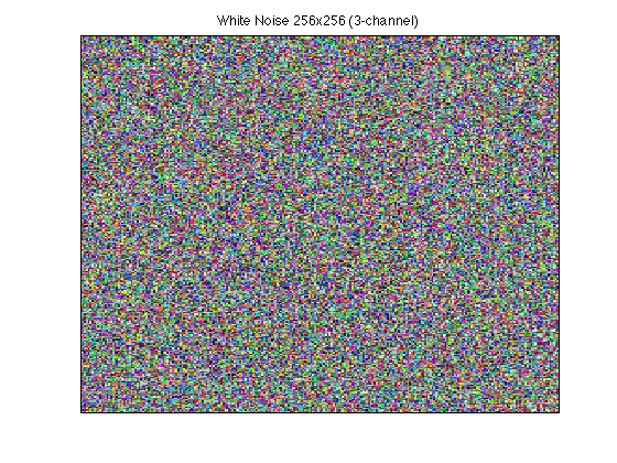
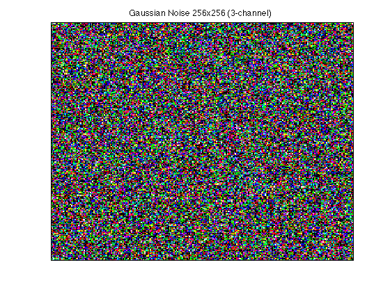
The above plot shows three channel (RGB) textures of white/uniform noise and the same for Gaussian noise (ranges clipped to [0, 1]); they are not that useful. Instead of using true random numbers, pseudorandom numbers are generated which provide repeatable results that are still visually appealing. Ken Perlin described noise as the salt or flavor of computer graphics. With the right ingredients, a bland graphics recipe can be turned into something quite extraordinary.

